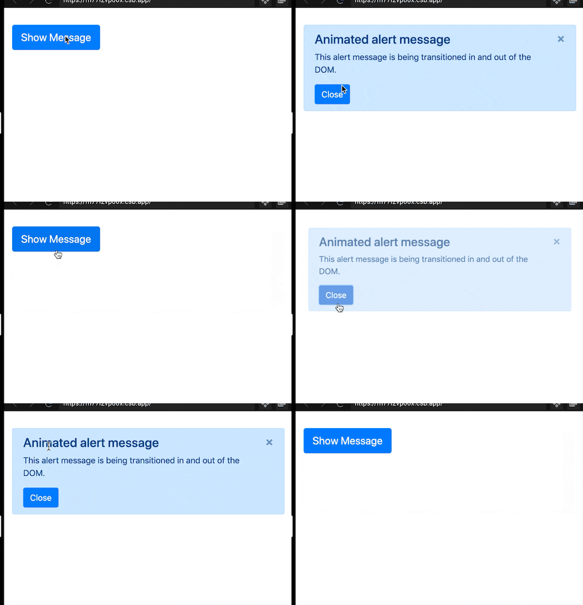
When we write some UI components, it is easy to implement them without considering dynamic effects, mainly the toggle of presence or absence (similar to the v-if property in Vue) or visibility (similar to the v-show property in Vue).
1. Pop-ups without motion
In React, it can be implemented like this.
 1
 2
 3
 4
 5
 6
 7
 8
 9
10
11
12
13
14
|
interface ModalProps {
  open: boolean;
  onClose?: () => void;
  children?: any;
}
const Modal = ({open. onClose, children}: ModalProps) => {
  if (!open) {
    return null;
  }
  return createPortal(<div>
    <div className="modal-content">{children}</div>
    <div className="modal-close-btn" onClick={onClose}>x</div>
  </div>, document.body);
};
|
Usage.
 1
 2
 3
 4
 5
 6
 7
 8
 9
10
11
12
|
const App = () => {
  const [open, setOpen] = useState(false);

  return (
    <div className="app">
      <button onClick={() => setOpen(true)}>show modal</button>
      <Modal open={open} onClose={() => setOpen(false)}>
        modal content
      </Modal>
    </div>
  );
};
|
Here we are using the open property to control whether to show or not, but there is no fade effect at all.
If we want to implement fade, zoom and other animation effects, we need to modify this.
2. Do-it-yourself pop-ups with dynamic effects
Many students often have dynamic effects when they are displayed, but no dynamic effects when they are closed. It’s because the timing of the dynamic effect is not well controlled. Let’s realize the flow of dynamic effects by ourselves.
At the beginning, when I implemented it, there was only a start state and an end state, so I needed a lot of variables and logic to control the effect.
Then I referred to the implementation of the react-transition-group component, which splits the effect into several parts, each of which is controlled separately.
- The order to expand the effect: enter -> enter-active -> enter-done.
- The order of closing the dynamic effect: exit -> exit-active -> exit-done.
The animation process is in the process of enter-active and exit-active.
We then use a variable active to control whether the close effect is executed or not, and the open parameter only controls whether the expand or close effect is executed.
When both open and active are false, the popup is destroyed.
 1
 2
 3
 4
 5
 6
 7
 8
 9
10
11
12
13
14
15
16
17
|
const Modal = ({ open, children, onClose }) => {
  const [active, setActive] = useState(false); // 弹窗的存在周期

  if (!open && !active) {
    return null;
  }

  return ReactDOM.createPortal(
    <div className="modal">
      <div className="modal-content">{children}</div>
      <div className="modal-close-btn" onClick={onClose}>
        x
      </div>
    </div>,
    document.body,
  );
};
|
Here we then add the changes to the kinetic process.
 1
 2
 3
 4
 5
 6
 7
 8
 9
10
11
12
13
14
15
16
17
18
19
20
21
22
23
24
25
26
27
28
29
|
const [aniClassName, setAniClassName] = useState(''); // 动效的class

// transition执行完毕的监听函数
const onTransitionEnd = () => {
  // 当open为rue时,则结束状态为'enter-done'
  // 当open未false时,则结束状态为'exit-done'
  setAniClassName(open ? 'enter-done' : 'exit-done');

  // 若open为false,则动画结束时,弹窗的生命周期结束
  if (!open) {
    setActive(false);
  }
};

useEffect(() => {
  if (open) {
    setActive(true);
    setAniClassName('enter');
    // setTimeout用来切换class,让transition动起来
    setTimeout(() => {
      setAniClassName('enter-active');
    });
  } else {
    setAniClassName('exit');
    setTimeout(() => {
      setAniClassName('exit-active');
    });
  }
}, [open]);
|
The complete code of the Modal component is as follows.
 1
 2
 3
 4
 5
 6
 7
 8
 9
10
11
12
13
14
15
16
17
18
19
20
21
22
23
24
25
26
27
28
29
30
31
32
33
34
35
36
37
38
39
|
const Modal = ({ open, children, onClose }) => {
  const [active, setActive] = useState(false); // 弹窗的存在周期
  const [aniClassName, setAniClassName] = useState(''); // 动效的class
  const onTransitionEnd = () => {
    setAniClassName(open ? 'enter-done' : 'exit-done');
    if (!open) {
      setActive(false);
    }
  };

  useEffect(() => {
    if (open) {
      setActive(true);
      setAniClassName('enter');
      setTimeout(() => {
        setAniClassName('enter-active');
      });
    } else {
      setAniClassName('exit');
      setTimeout(() => {
        setAniClassName('exit-active');
      });
    }
  }, [open]);

  if (!open && !active) {
    return null;
  }

  return ReactDOM.createPortal(
    <div className={'modal ' + aniClassName} onTransitionEnd={onTransitionEnd}>
      <div className="modal-content">{children}</div>
      <div className="modal-close-btn" onClick={onClose}>
        x
      </div>
    </div>,
    document.body,
  );
};
|
The flow of dynamic effects has been implemented, and the style should be written together. For example, we want to implement a fade effect.
 1
 2
 3
 4
 5
 6
 7
 8
 9
10
11
12
13
14
15
16
17
18
19
20
|
.enter {
  opacity: 0;
}
.enter-active {
  transition: opacity 200ms ease-in-out;
  opacity: 1;
}
.enter-done {
  opacity: 1;
}
.exit {
  opacity: 1;
}
.exit-active {
  opacity: 0;
  transition: opacity 200ms ease-in-out;
}
.exit-done {
  opacity: 0;
}
|
If you want to zoom in and out, just modify these classes.
A popup window with dynamic effects is already implemented.
Usage.
 1
 2
 3
 4
 5
 6
 7
 8
 9
10
11
12
|
const App = () => {
  const [open, setOpen] = useState(false);

  return (
    <div className="app">
      <button onClick={() => setOpen(true)}>show modal</button>
      <Modal open={open} onClose={() => setOpen(false)}>
        modal content
      </Modal>
    </div>
  );
};
|
Click on the link here to see the results.
Similarly, there are Toast and the like, which can be implemented in this way.
3. react-transition-group
We borrowed from the CSSTransition component of the react-transition-group for our idea of implementing a dynamic effect. The CSSTransition has already wrapped up the process of expanding and closing the effect for me, so we can use this component directly when implementing the popup.
Here is an important property: unmountOnExit, which indicates that the component is unmounted after the kinetic effect is finished.
 1
 2
 3
 4
 5
 6
 7
 8
 9
10
11
12
13
14
15
|
const Modal = ({ open, onClose }) => {
  // http://reactcommunity.org/react-transition-group/css-transition/
  // in属性为true/false,true为展开动效,false为关闭动效
  return createPortal(
    <CSSTransition in={open} timeout={200} unmountOnExit>
      <div className="modal">
        <div className="modal-content">{children}</div>
        <div className="modal-close-btn" onClick={onClose}>
          x
        </div>
      </div>
    </CSSTransition>,
    document.body,
  );
};
|
With the CSSTransition component, Modal’s dynamic effects are much easier to use.

4. Summary
We have now implemented the React Modal component to be actuated. Although there is no official <transition> tag in React like the one defined by Vue, we can implement it ourselves or with third-party components.
