Widgets have been an important part of Android since 2008 and are an important aspect of customising the home screen. You can think of a widget as an ‘at-a-glance’ view of the app, giving the user a glimpse of the app’s data and core functionality without having to open the app from the home screen. But the AppWidget API has remained largely unchanged since the launch of Android, with only one version of Android from 2012 to 2021 containing an update to the AppWidget API. With the introduction of Android 12, there have been some much needed updates to the Widget API.
In this article we’ll take a look at what updates to the Widget API are available in Android 12 and what great tools are available to make developing app widgets even better. If you prefer to see this in a video, please click here.
How Widgets work
A widget runs in a remote process called AppWidgetHost, such as the Home Screen Launcher, and because of this, it has some restrictions on its operation. Let’s take a look at how widgets work.

On the front end, the application first registers the AppWidgetProvider to define the widget behaviour and the AppWidgetProviderInfo to define the metadata. AndroidManifest then references this information, allowing the OS to read the metadata via AndroidManifest, such as the initial layout and default size of the widget, and providing a preview of the widget, followed by the provider using a linked account to update the layout and make updates to the widget. It is important to note here that there are a limited number of builds applied to the widget, so the OS updates the widget via a broadcast event from the recipient (which contains the update information). This also means that the widget is updated periodically by receiving information from the application.
APIs
The launch of Android 12 brought a lot of updates to the AppWidget API, this article will not cover all of them, but will focus on a few APIs that are very useful for widget building.
Implementing rounded corners
Many key interface elements are now rounded in Android 12. To make AppWidgets look consistent with other system components, Android 12 introduces system_app_widget_background_radius and system_app_widget_inner_radius two new system parameters to implement rounded corners, the former to set the radius of the widget’s rounded corners and the latter to set the radius of the widget’s inner view. The latter sets the radius of the rounded corners of the widget’s inner view. To use these parameters, it is sufficient to define a drawable object with the system parameter corner set, as shown in the code:
|
|
The drawable object is then applied to the widget’s external container, which applies the rounded corner radius provided by the system parameters to the widget’s background. Similarly, the drawable object of the internal view is applied to the layout representing the widget’s internal container, as shown in the code:
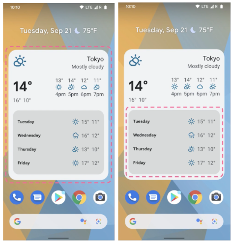
△ Left: widget rounded corners; right: inner view rounded corners
From the effect we can see that the radius of the rounded corners of the widget’s current inner container is smaller than that of the outer container, which is how the new parameter is used.
Dynamic colours
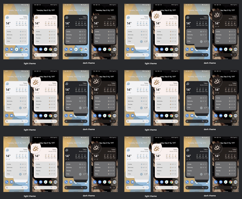
As we previously announced at Google I/O, starting with Android 12, widgets can use device theme colours for buttons, backgrounds and other components, including light and dark themes. This allows for smoother transitions and consistency from widget to widget.
We’ve added a dynamic colour API so you can get and use the theme background, colour and other parameters provided on the Pixel device system directly to keep the widget in line with the home screen:
You can see that when the theme properties are set, the widget takes the primary colour directly from the system wallpaper and applies it to the dark and light theme backgrounds.
Responsive Layout
Android 12 introduces a new API for responsive layout, which automatically switches to a different layout as the widget is resized. As shown in the image below, the user can drag to change the size of the widget at will, and the widget will dynamically update the content to be displayed depending on the size.
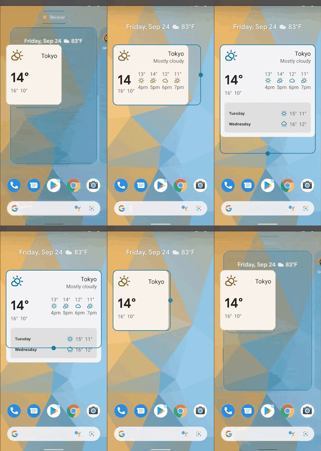
So how do you make a widget dynamically update its display as its size changes? We define three different parameters, the minimum supported width and height, and the corresponding RemoteView within this size range, and the system will automatically adjust the widget to the actual size.
|
|
Android 12 also provides new targetCellWidth and targetCellHeight properties, which specify the default larger cell size when the widget is placed on the home screen. Prior to Android 12, you could use the minWidget and minHeight properties, which specified the default widget size in dp, and we recommend specifying both properties for backwards compatibility. If your widget is resizable then you can also use the minResizeWidget/Height and maxResizeWidget/Height properties provided by Android 12 to limit the resizable range of the widget.
Widget selector
Android 12 has also improved the experience of using the Widget selector by introducing two new properties, the first being description, which provides a descriptive description of what the Widget selector does, and the other being previewLayout, which specifies the The other is previewLayout, which specifies the XML layout to be displayed in the widget selector. In fact before Android 12 it was possible to use the previewImage property to specify static resources to achieve a similar effect, but the previewLayout is more precise and convenient in comparison. In addition, as these previews are built at runtime, they can also be dynamically adapted to the device’s theme.
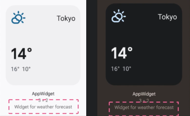
△ description attribute
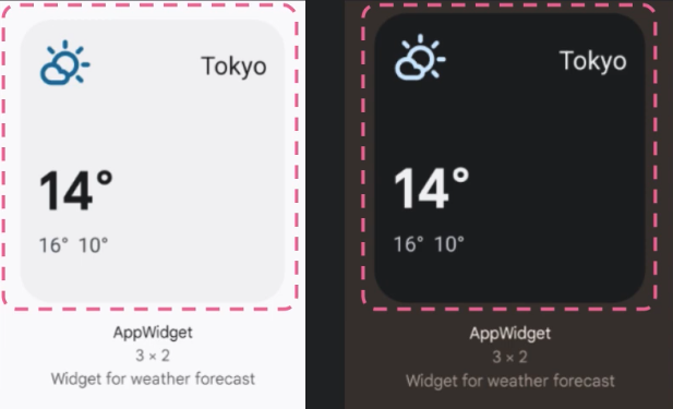
△ previewLayout property
Many of the new APIs introduced in Android 12 have been introduced so far, and it is likely that we will soon see more and more apps using the new APIs to build a more modern widget experience.
Glance
To build great widgets, in addition to the more modern APIs available today, we need more modern and better tools to help us, and Glance is one such great tool that has been added to the Jetpack family. This means that you can use Glance to build interfaces in composable and convert them to remote views for display in widgets, as well as using the new Android 12 API mentioned earlier and making them as backwards compatible as possible. Glance will also take care of some of the widget lifecycle and other common operations, which sounds very convenient.
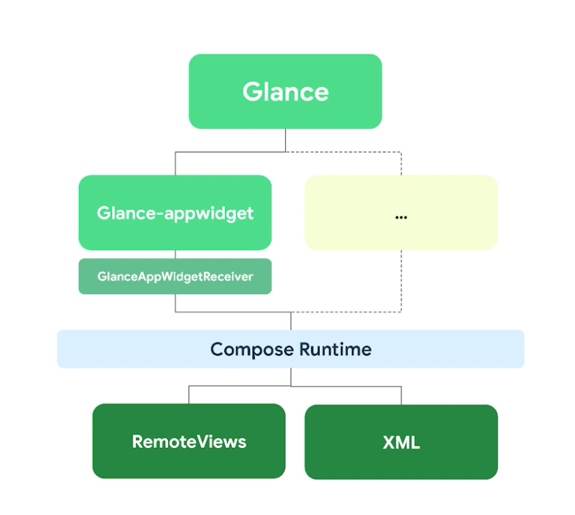
△ Glance structure diagram
Next we cover how to build a widget using Glance, first you still need to declare the AppWidget as before and link it to the receiver in AndroidManifest, of course we use the GlanceAppWidgetReceiver provided by Glance here and the GlanceAppWidget, Glance will handle most of the work for you, you just need to override the Content method in MyAppWidget to provide the AppWidget content. Instead of using XML syntax when defining content, Compose syntax is used and the content to be displayed will be converted to a remote view for display in the AppWidget.
|
|
One thing to understand is that although Glance uses the Compose Runtime and Compose syntax, it is still a standalone framework and it is not possible to reuse components defined in the Jetpack Compose UI due to the limitations of building on the remote side. However, if you are already familiar with Jetpack Compose, then Glance will be very easy to understand.
Also, because Glance uses the user event API to handle interactions, it will be easier for us to handle interactions with users. If you know how widgets work you will know that widgets work on different processes, which makes it difficult to handle even simple user events, as not being in the same process means you don’t own the widget and have to handle events via process callbacks.
Glance abstracts away this complexity by defining a clickable modifier for the composable object you need to support handling user click events, Glance abstracts away all the injected behaviour and the user clicks on the composanle to call back the defined action. We have also defined some common actions, such as how to launch an Activity, by calling launchActivity and passing in the Activity target class.
For example, we may want to update the geolocation and refresh the widget whenever the user clicks this button, as shown in the code below, Glance will handle some of the work that needs to be injected for you behind the scenes and process the click through the broadcast receiver, ultimately calling the code for the action you defined. Please note, however, that if this is a more time consuming operation such as a network request or database access, please use the WorkManager API.
As we mentioned earlier, you can use resizable widgets, but dealing with different responsive layouts is no easy task, and Glance has tried to make this a little easier by defining three different SizeMode options.
SizeMode.Single is the default option, which specifies that the content of the widget we define here will not change as the available size changes, meaning that the minimum supported size we define on the widget metadata will only be called once via the Content method, and if the available size of the widget changes, for example if the user resizes the If the available size of the widget changes, for example if the user resizes the widget, the content will not be refreshed. This is because the Content method is only called once and the content is not refreshed when the size changes.
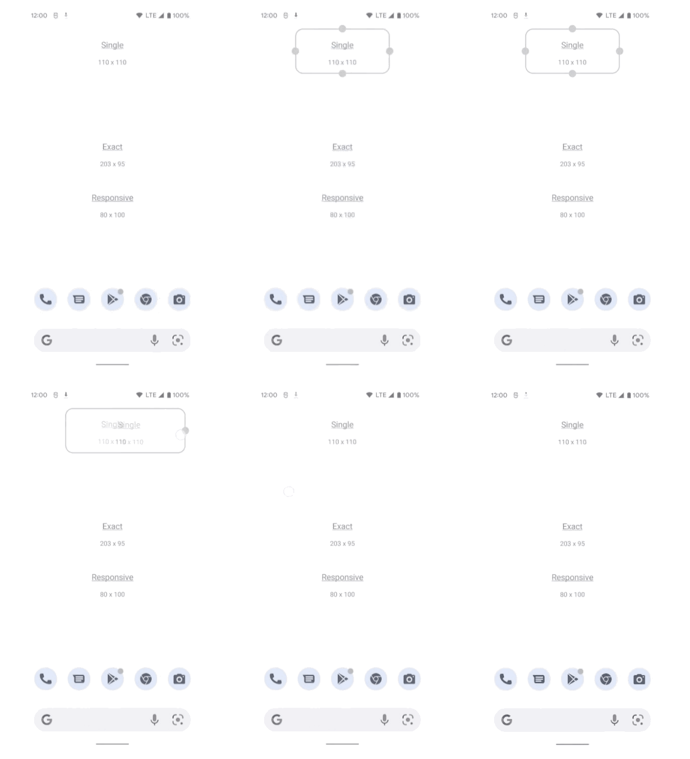
△ Diagram of SizeMode.Single option
The SizeMode.Exact option can be used if the content is refreshed each time the size changes. This option will recreate the widget interface and call the Content method again each time the user resizes the widget, as well as providing the maximum size available so that we can change the interface if there is enough space, such as adding additional buttons etc. In the image below, the internal output of the widget changes whenever the size of the widget changes, as the widget interface is recreated each time.
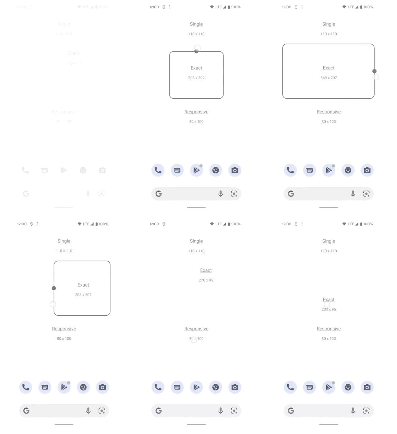
△ SizeMode.Exact option diagram
Although the SizeMode.Exact option seems to work perfectly, the need to recreate the interface each time may cause the user to have some performance issues with the interface transitions when resizing, so we can use the SizeMode.Responsive option. For example, here we have mapped some sizes to certain shapes and Glance will call the Content method defined for each Size whenever an AppWidget is created or updated, each time mapping to a specific size and storing it in memory, allowing the system to select the most appropriate size based on the available sizes when the user resizes the widget, without having to recreate it. The interface provides smoother transitions and better performance. As the diagram below illustrates, when a widget size is changed, its internal output will only change if it matches the pre-defined size range, and it should be noted that the interface is not recreated at this point.
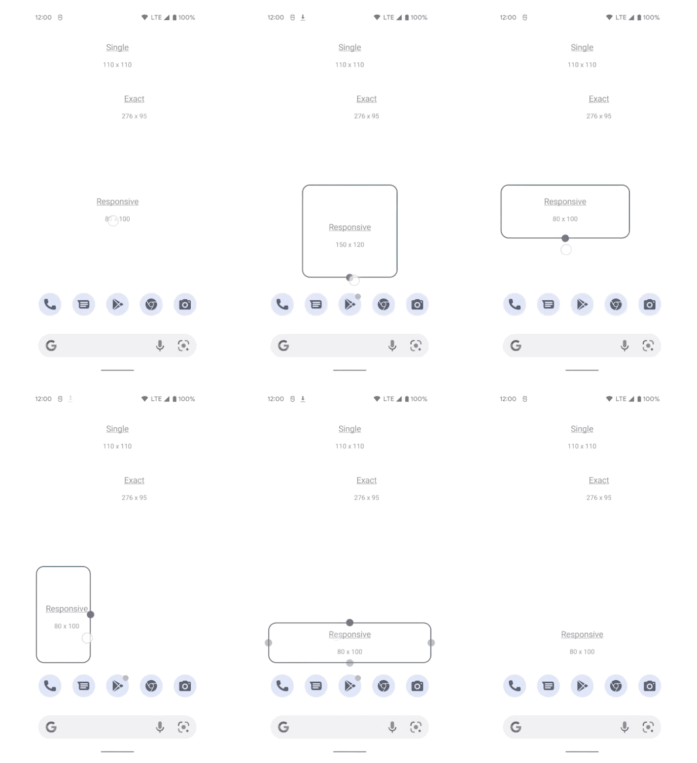
△ Diagram of SizeMode.Responsive option
Similarly, we can also define more diverse styles in the Content() method to allow the widget to display more unique content at different sizes.
|
|
In addition to the above, there is much more to explore, such as support for widget state management and out-of-the-box Material You themed backgrounds.
For more information, please check out the Android developer website: App Widget Overview, we’re looking forward to you trying out the new APIs we have to offer and seeing the widgets you build and your feedback.