One advantage of decision trees over other algorithms is the ability to visualize decision tree models. Decision trees are subdivided into classification trees, which are used to predict classifications, and regression trees, which are used to predict values. The visualization of decision trees can help us to understand the details of the algorithm in a very intuitive way. However, some problems may be encountered during the specific use. The following are some of the considerations collated.
Graphviz visualization tool
Graphviz is an open source graph (Graph) visualization software that uses abstract graphs and networks to represent structured information. One use of Graphviz in the field of data science is to implement decision tree visualization. There are still some gateways between using Graphviz. If you install graphviz using pip install graphviz the following error is reported.
ExecutableNotFound: failed to execute ‘dot’, make sure the Graphviz executables are on your systems’ PATH
The solution is to install the executable package of Graphviz and add the installation path to the PATH of the environment variable. How to use it.
Export_graphviz to export the tree to Graphviz format
Here a plain text file iris.dot will be generated, which you can open directly to view, similar to.
|
|
Convert .dot files to visual graphics
To have better visualization, you can use the dot program in the graphviz executable package to convert it into a visual PDF document.
This is done by executing the following command.
|
|
After converting the PDF opened the following graphics.
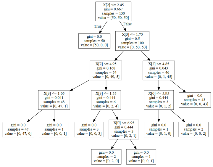
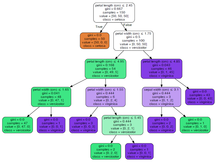
Using the command line is very cumbersome, you can take the approach of installing pydotplus (pip install pydotplus) to generate PDFs. In addition, when using tree.export_graphviz to export data is also possible to add some additional parameters to make the picture look easier to understand.
|
|
|
|
Parameters passed in.
- decision_tree: decision tree object
- out_file: handle or name of the output file.
- max_depth: the maximum depth of the number
- feature_names: list of feature names
- class_names: list of category names, sorted in ascending order
- label: option to display purity information {‘all’, ‘root’, ’none’}
- filled: plot nodes to indicate the purity of nodes for most classes of a classification, extreme values of regression values, or multiple outputs.
- leaves_parallel: plot all leaf nodes at the bottom of the tree.
- impurity: whether to show purity display
- node_ids: whether to show the ID number of each node
- proportion: change the display of “value” and “sample size” to proportion respectively.
- rotate: set unTrue to draw from left to right, False to draw from top to bottom.
- rounded: if set to not True, draws with rounded corners.
- special_characters: False when set to ignore special characters to achieve PostScrip compatibility.
- precision: the precision of each node value
If you feel that the generation of PDF view is more trouble, you can take the generation of images.
|
|
scikit-learn’s tree.plot_tree
Starting with scikit-learn version 21.0, it is possible to use scikit-learn’s tree.plot_tree method to visualize decision trees using matplotlib, instead of relying on the hard-to-install dot library (no need to install Graphviz). The following Python code shows how to visualize a decision tree using scikit-learn.
|
|
Since it is similar to tree.export_graphviz in use, we will not go into details here.
Beautify the output dtreeviz
dtreeviz is a component that beautifies the output and is very simple to use.
|
|
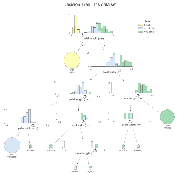
At each node, we can see the stacked histogram of the features used to split the observations, colored by class. In this way, we can see how the classes are split. the small triangles on the x-axis are the splitting points. The leaf nodes are represented by pie charts that show which class the observations in the leaf belong to. This way, we can easily see which class is the most dominant and so also the predictions of the model. We can also create a similar visualization for the test set by simply replacing the x_data and y_data parameters when calling the function. If you don’t like histograms and want to simplify the plot, you can specify fancy=False to receive the following simplified plot.
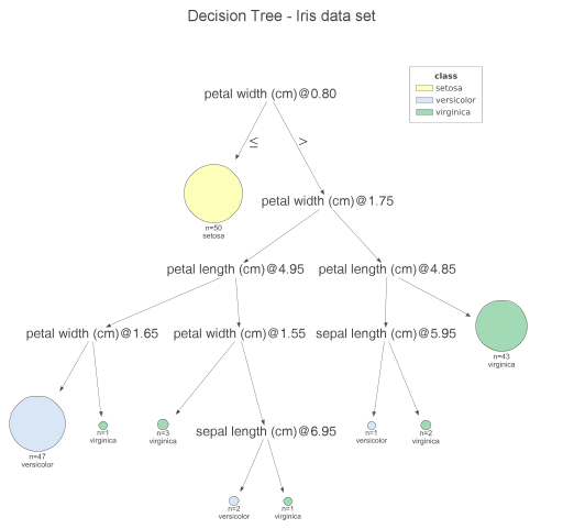
Another handy feature of dtreeviz is to improve the interpretability of the model, i.e. to highlight the path of a particular observation on the plot. In this way, we can clearly see which features contribute to class prediction. Using the following code snippet, we highlight the path of the first sample of the test set.
|
|
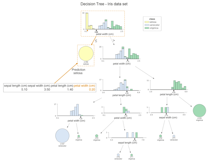
This graph is very similar to the previous one, however, the orange highlights clearly show the path followed by the sample. In addition, we can see the orange triangle on each histogram. It indicates the observed value for a given feature. We can also change the orientation of the plot by setting orientation=“LR” from top to bottom and then from left to right.
Finally, we can print the decision used for this observation prediction in plain English.
|
|
The previous article has introduced the decision tree classification example, the next required look at the decision tree regression.
|
|
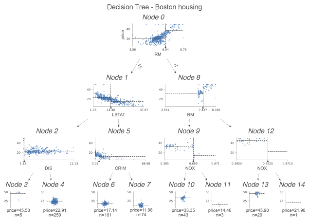
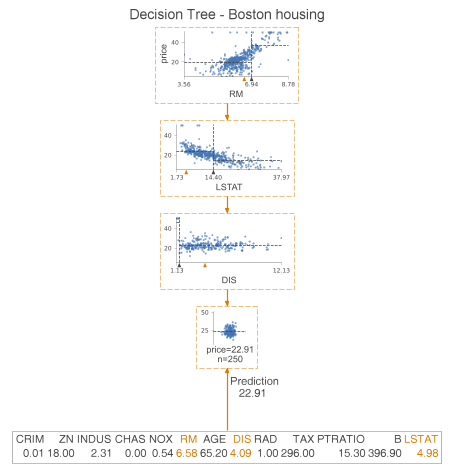
We examine the difference between classification trees and regression trees. This time instead of histograms, we examine the scatterplots of features used for segmentation and targeting. We see some dashed lines on these scatterplots. Their interpretation is as follows.
- The horizontal line is the target mean of the left and right edges in the decision node.
- The vertical line is the segmentation point. It represents exactly the same information as the black triangle.
In the leaf nodes, the dashed lines indicate the average of the targets within the leaves, which are also predicted by the model. We can go a step further and plot only the nodes used for prediction. To do this, we specify show_just_path=True. The figure below shows only the selected nodes in the tree above.
|
|
